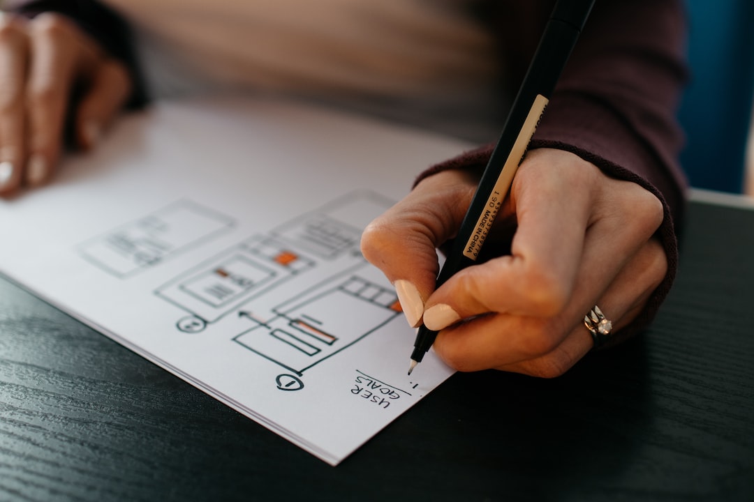
For designers, whitespace is the foundation of a great design. It is the space between elements on a page or screen, and while it may not be the first thing that comes to mind when imagining a design, it is a crucial aspect of it. Whitespace is the area left intentionally blank, around and between sections of visual content, and forms an essential part of the design. It may seem like a waste of space, but it is not; in fact, whitespace is vital in design, and here is why.
Whitespace makes the design look organized and elegant
Organizing a design well is not easy as it takes skill and balance. The balance between the negative and positive spaces of a design defines its elegance. Adding too much graphic content to a page makes it look cluttered, unattractive, and complicated. To make a design look organized and appealing, whitespace provides the breathing room that makes the graphics pop. Adequate spacing gives the viewer’s eyes a break, making it easier to recognize graphic content and maintain focus throughout.
Whitespace communicates importance
Whitespace draws the viewer’s eye to certain sections of the design, without any additional prompting. By placing an image or an element surrounded by whitespace, the viewer’s eye gets drawn even more to the content. This is known as the isolation principle in design. An element surrounded by space indicates that it should stand out and draws attention to the area.
Whitespace provides clarity
One of the significant functions of whitespace in design is its ability to enhance clarity. For instance, adding margins and padding to text blocks add whitespace around the writings, making it easier for viewers to read the content. Text without enough spacing causes the viewer’s eyes to tire quickly, and can even cause distraction from the content.
Whitespace directs attention
Whitespace is a way of directing a viewer to where the designer desires, by framing a design element with whitespace. This can be deepened further, by adding a background-of-a-different-color to indicate a grouping of design elements like text or images.
Whitespace creates an emotional response
Whitespace allows a design to speak volumes without necessarily adding more content. It can create a powerful visual statement. An effective use of white space can change the way an audience interacts with the design – creating feelings of calmness, openness, and expansiveness.
In conclusion, whitespace is a vital aspect of design, and this has become more evident as more and more designs continue to be created. Its benefits make it a vital piece more than ever before. Incorporating whitespace in a design is an excellent way of creating a distinctive and professional look that can stand the test of time. How whitespace is used determines whether a design is boring or breathtaking, so it is important to use whitespace effectively. By skilfully using whitespace as a backdrop and template for graphic elements, designers can achieve elegance, creativity, and simplicity all at once. This will result in a design that is beautiful, clear, and easily understood by its viewers.

